Role
Lead UI/UX Designer
Problem
The design of TrainingPeaks' Training Plan Library was outdated and inaccessible. Many aspects of the design contributed to user confusion and a generally cumbersome experience. I was in charge of redesigning the Training Plan library as we made accessibility a priority and moved toward a more modern, clean design within the calendar view of the app.
Process
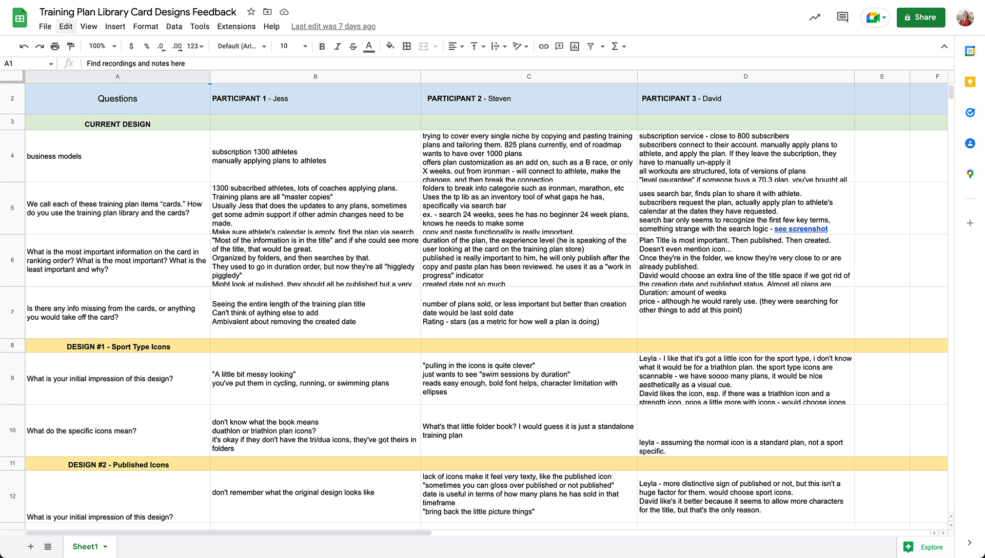
We had no previous documentation or data on how users were interacting with this library, or what information was valuable to them in each card. The company's business objective was creating more value for our power users, so I conducted user research and user interviews with this specific persona to establish a foundation for designing the library around what these users needed.
Interviews with coaches provided several emergent themes: They wanted more space to read the title of the plan, they wanted to see the duration of the plan, and they almost never used the creation date as they navigated the library. They were also mindful and concerned about how the new designs might effect their athletes' view.
Results
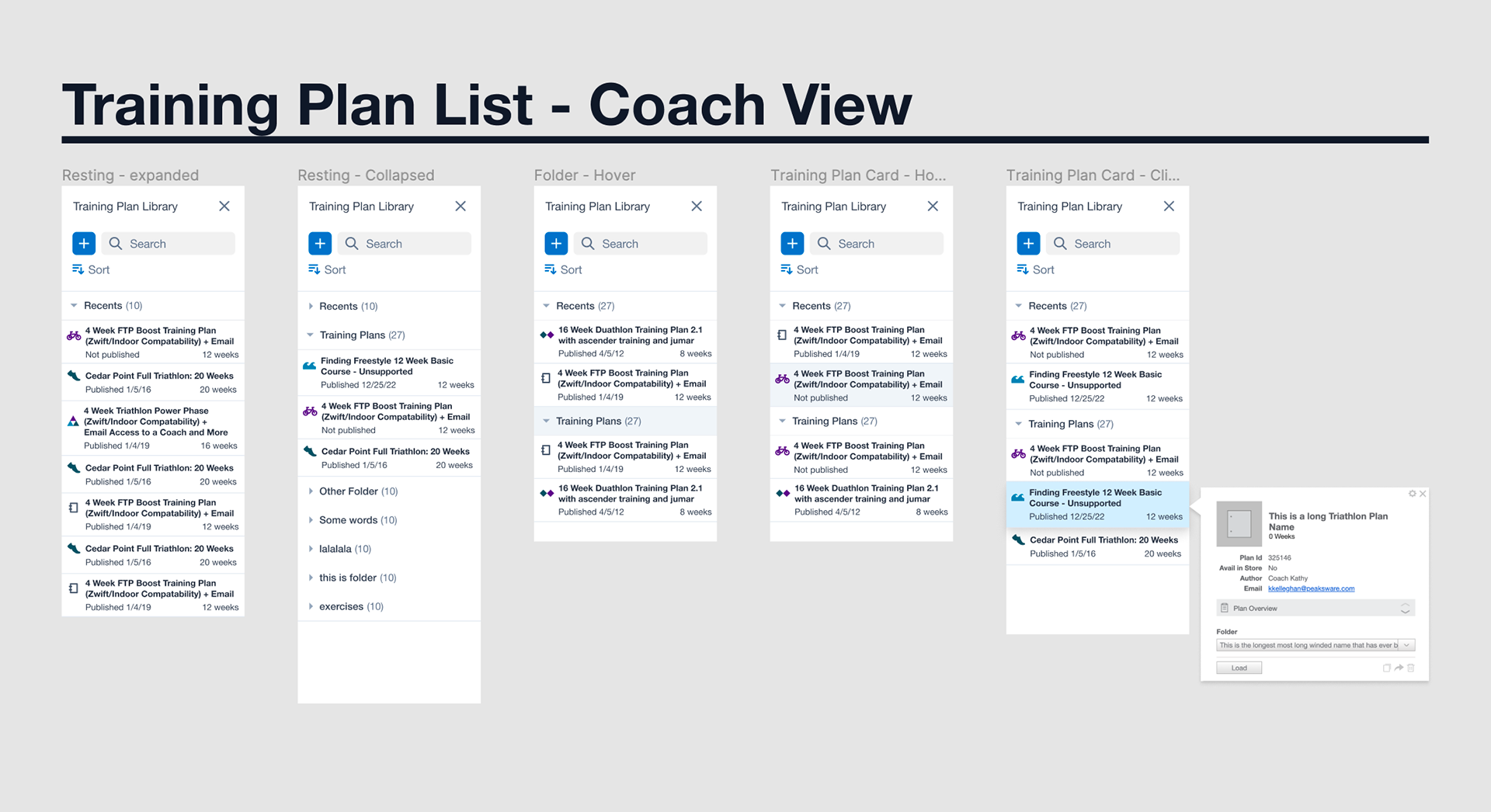
I designed the cards with an extra line of space for the title, adding the duration on each card where the creation date was previously. I swapped out the icon of a book with the icon for whatever sport type the plan was. I brought the font size and contrast ratio within AA compliancy standards.
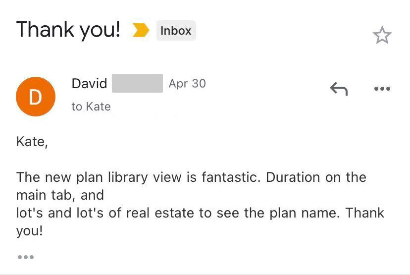
We will be monitoring feedback on the libraries as coaches and their athletes interact with the new designs. Qualitative feedback has been overwhelmingly positive as coaches can now read the entire title of their training plans and see the duration of the plans on each card when searching for the right plan to apply to the calendar.